Overview
ShortletPro is a digital platform that connects guests with short-term apartments while giving property managers an easy way to list and manage their properties. I worked as the sole UX/UI Designer, responsible for designing the responsive web app (for guests, property managers, and administrators) as well as the mobile app (for logged-in users and guest access).
Role
Brand Designer/ UX/UI Designer
Timeline
4 Months
Tools
Figma, Figjam, Google Suite
The Challenge
Guests in Nigeria often faced challenges when booking shortlets:
Lack of trust in listings due to limited reviews and unclear property details.
Cumbersome booking flows that led to high drop-offs.
Limited access to shortlets on mobile, which most users preferred.
On the other hand, property managers struggled with:
Difficult onboarding when listing apartments.
Manual management of reservations and guest communication.
Limited insights into property performance.
ShortletPro wanted a platform that solved both sides: a seamless guest booking experience and an efficient property management dashboard.
Our Solution
We created a dual platform solution for both property managers and guests ensuring efficiency, ease of use, and accessibility. Our solution offered an intuitive booking process for guests and a comprehensive management system for property managers.
Kickoff
To start the project, we held a google meet with the client where we discussed the deliverables and project materials. Since I already worked with the client to create the brand identity and style guide, I had all the documents I needed to get started on the design. These documents played a pivotal role in ensuring the final design aligned with the company's branding and vision.
Competitive Analysis
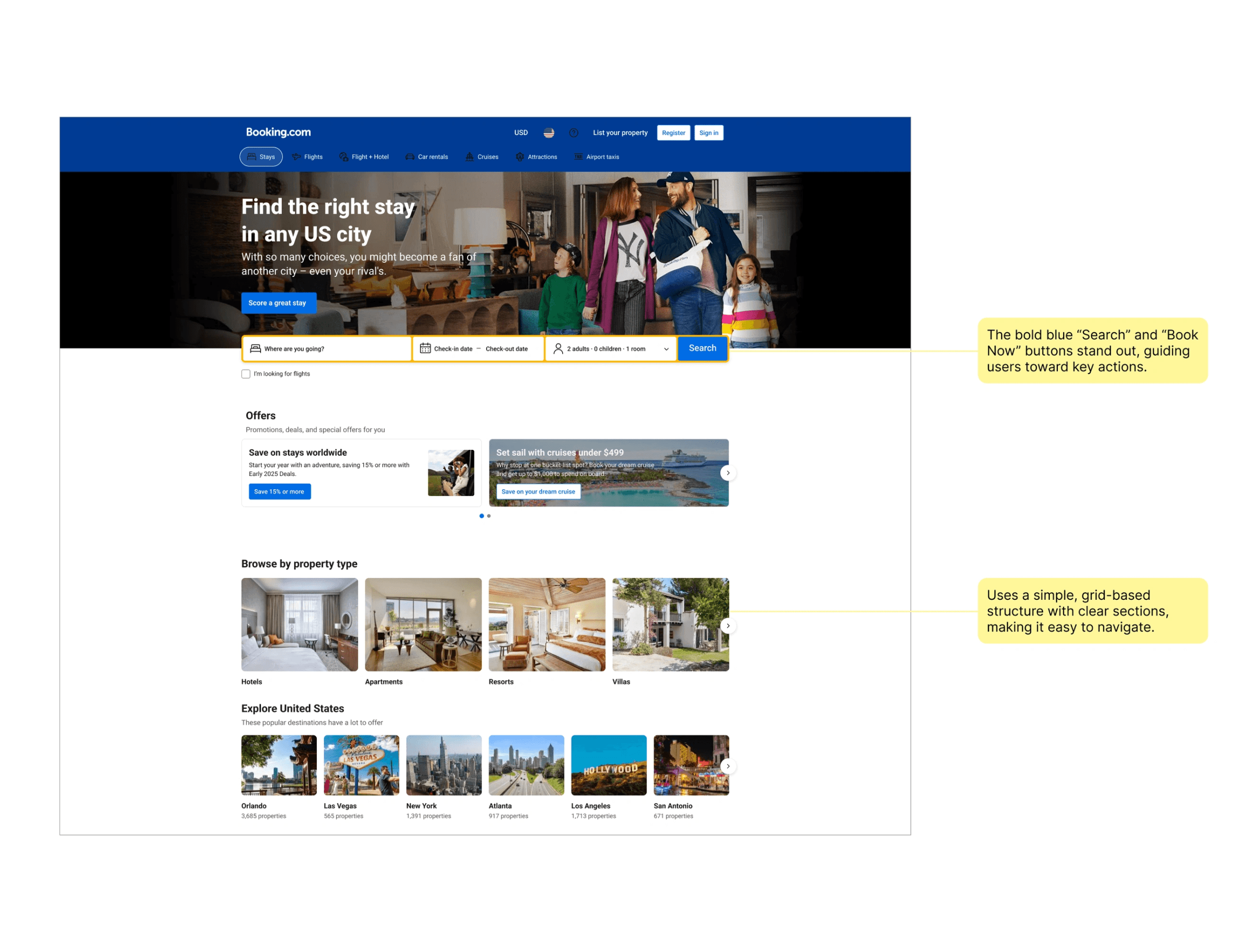
I reviewed established booking platforms such as Expedia, Zillow and Bookings.com to get a better understanding of best practices to apply on this project.
Key Takeaways
Despite showing a lot of information, the design prevents clutter through well-placed padding and spacing.
Icons help users quickly understand features like free cancellation, breakfast included, and star ratings.
Well-placed filters allow users to refine results without overwhelming them.
User Stories
The client provided the following user stories:
As a traveler using the ShortletPro mobile app, I want to easily browse through a diverse selection of short-term accommodations, so I can find the perfect place to stay for my trip.
As a traveler using the ShortletPro mobile app, I want to be able to select my preferred dates and choose from flexible payment options when booking a short-term accommodation, ensuring a seamless booking experience on my mobile device.
As a traveler using the ShortletPro mobile app, I want to receive instant confirmation of my booking, so I can have peace of mind knowing my accommodation is secured for my trip, directly on my mobile device.
As a property owner or manager using the ShortletPro mobile app, I want to easily access and manage my properties, including updating details, availability, and pricing, directly from my mobile device.
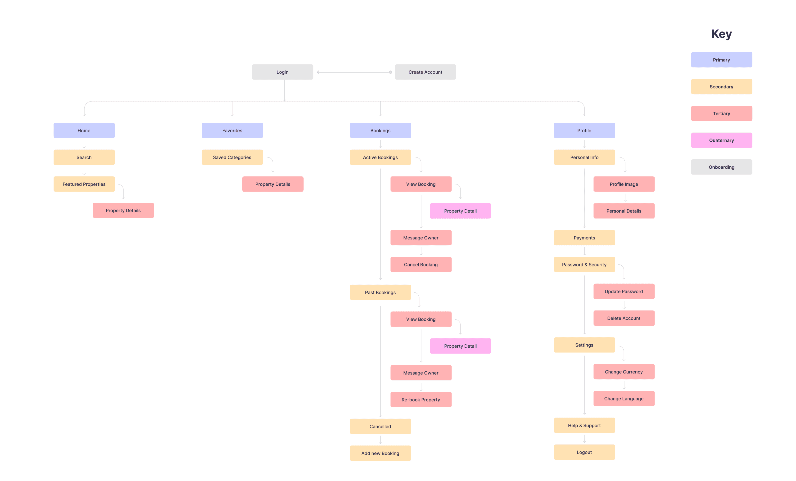
Sitemap
Drawing from my User Stories, I created a Site Map to visually illustrate the structure and content organization of the app. My goal was to structure the information architecture in an accessible and intuitive way for the user, and the process helped me understand how the vision for my product would fit into a functional context.
High Fidelity Designs
I started with the responsive web application as that was planned to be launched first before moving into the mobile application.
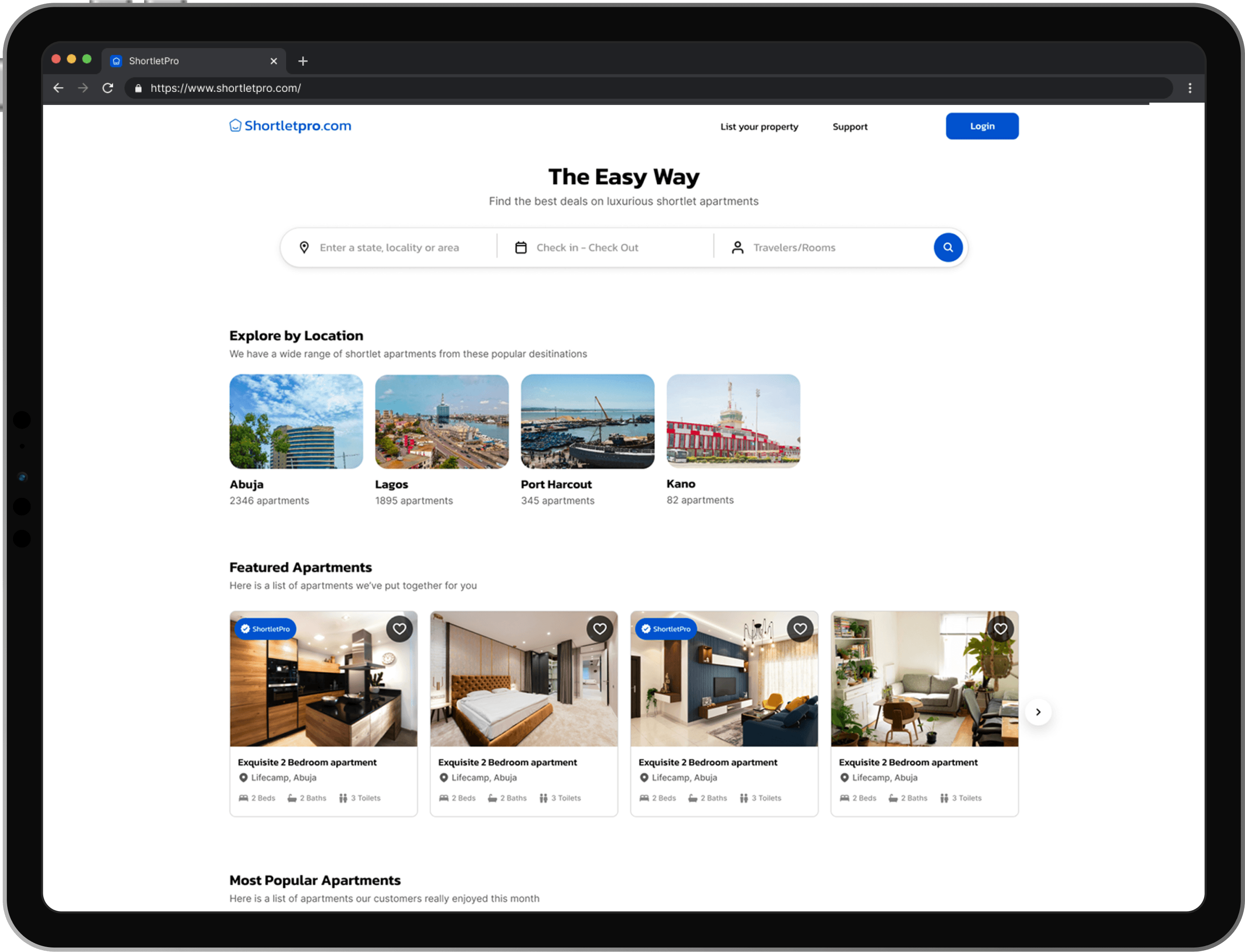
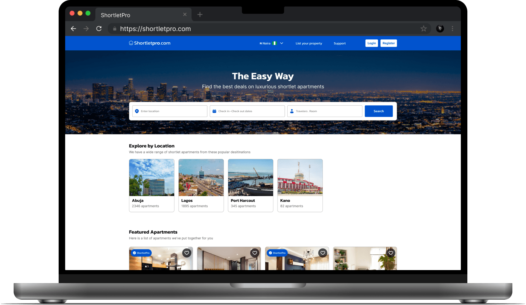
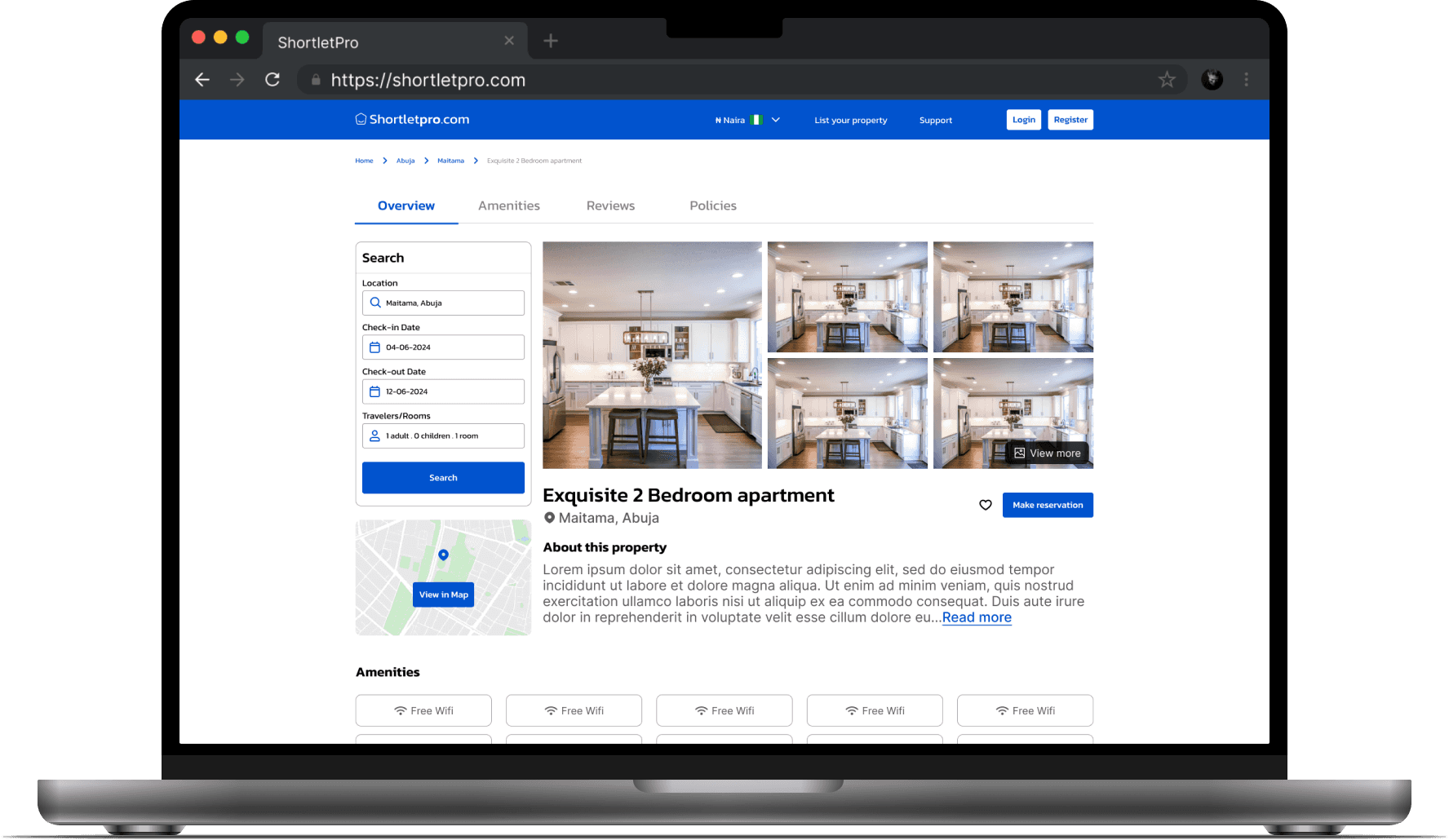
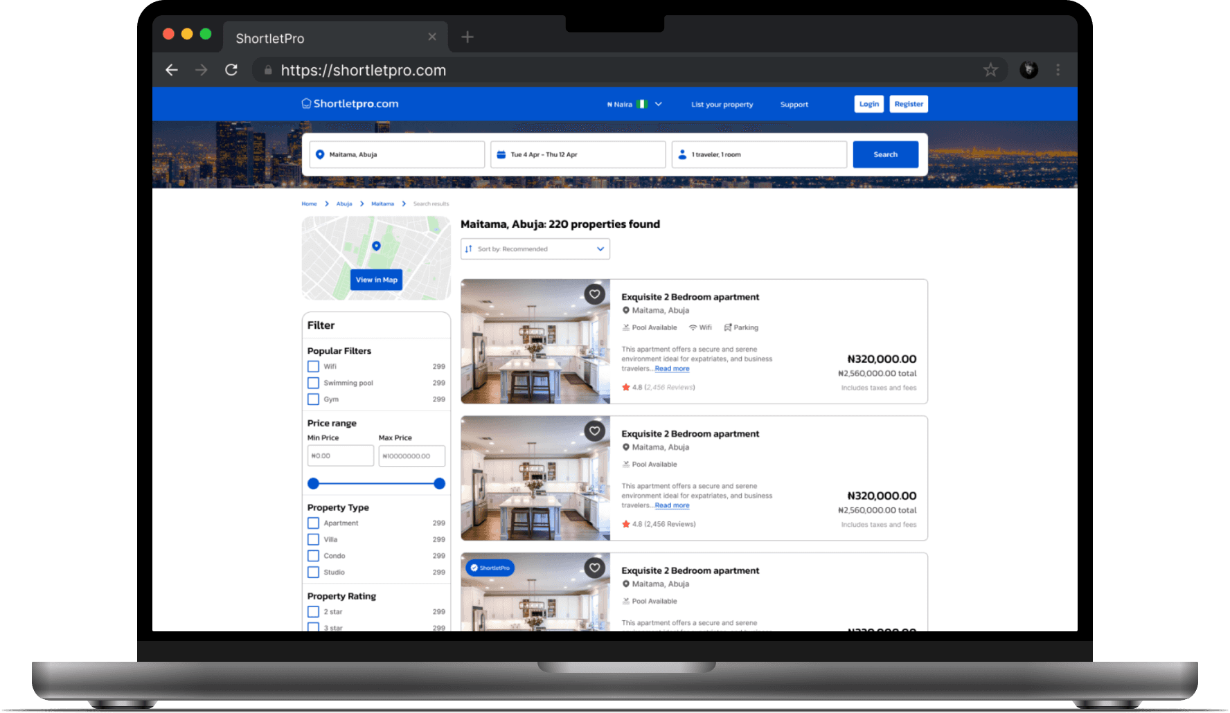
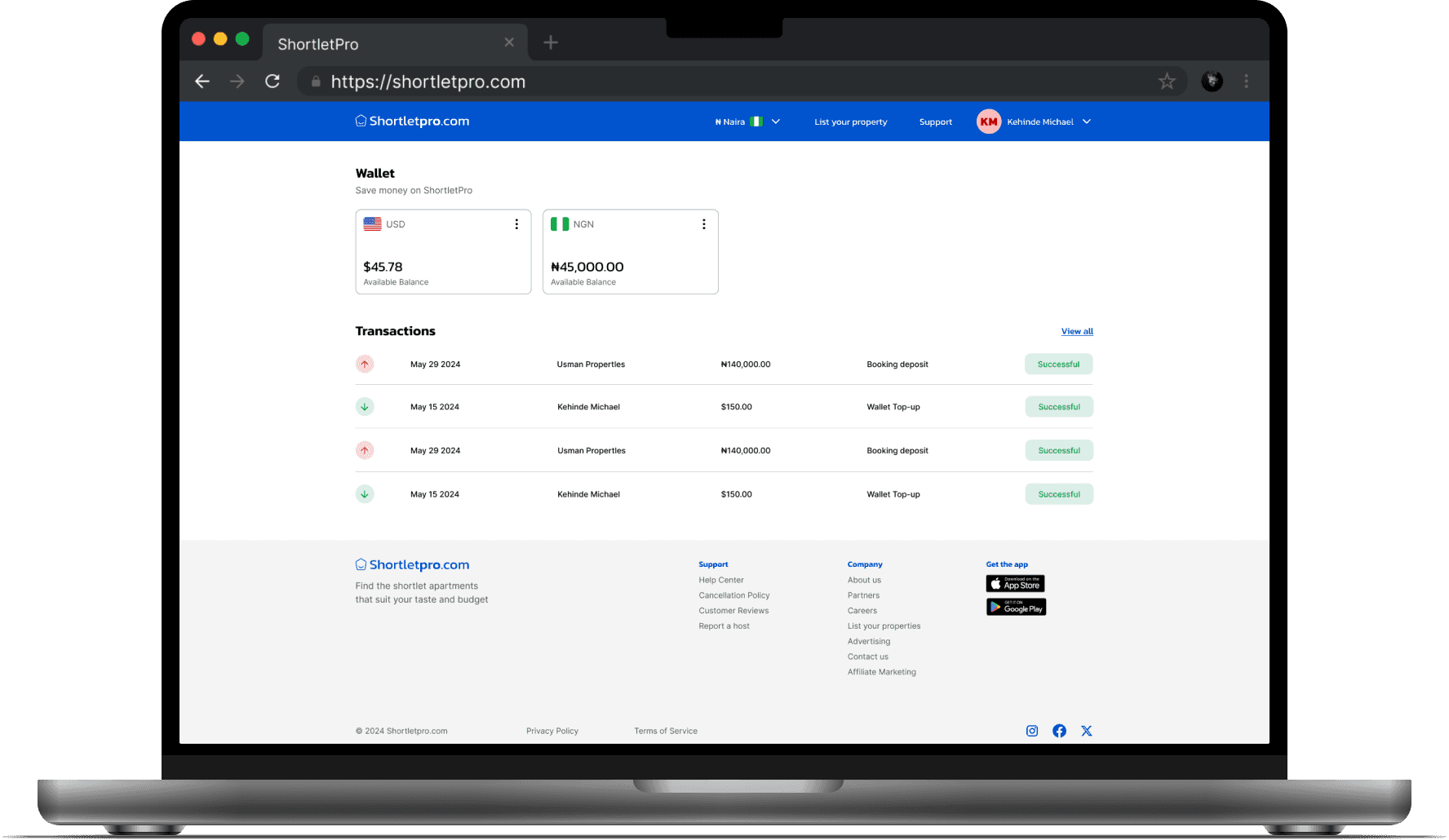
Web Application
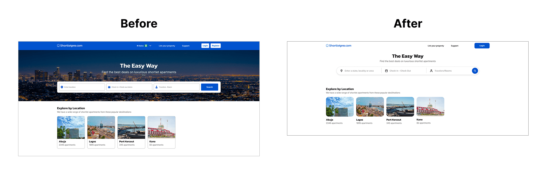
The web application included two paths, one for the guests, and the other for the property managers. For the guest home page, I added a hero image to create some visual emphasis around the form field. To enable to form stand out, I added an overlay to the image and made sure the form included all the major inputs to book a shortlet apartment. I used icons to provide visual cues and ensured all colors met WCAG requirements.
Moving on to the property manager application, I made sure important metrics (properties, booking requests, earnings) were prominently displayed at the top for quick insights. I also applied subtle color coding for status indicators (e.g., "In Progress" in orange, "Completed" in green) to add visual emphasis.
Mobile Application
Initially, we considered adding a dedicated search screen but after brainstorming, we decided to add the search bar directly on the home screen as that would be the core feature. We also added featured properties on the home screen so users can browse through options. Overall, it was quite a seamless process since we already had a solid foundation from working on the web app. We implemented the same principles and ensured all components met accessibility guidelines.
Iterations
After receiving feedback from the client, I made a couple of updates to the web app design.
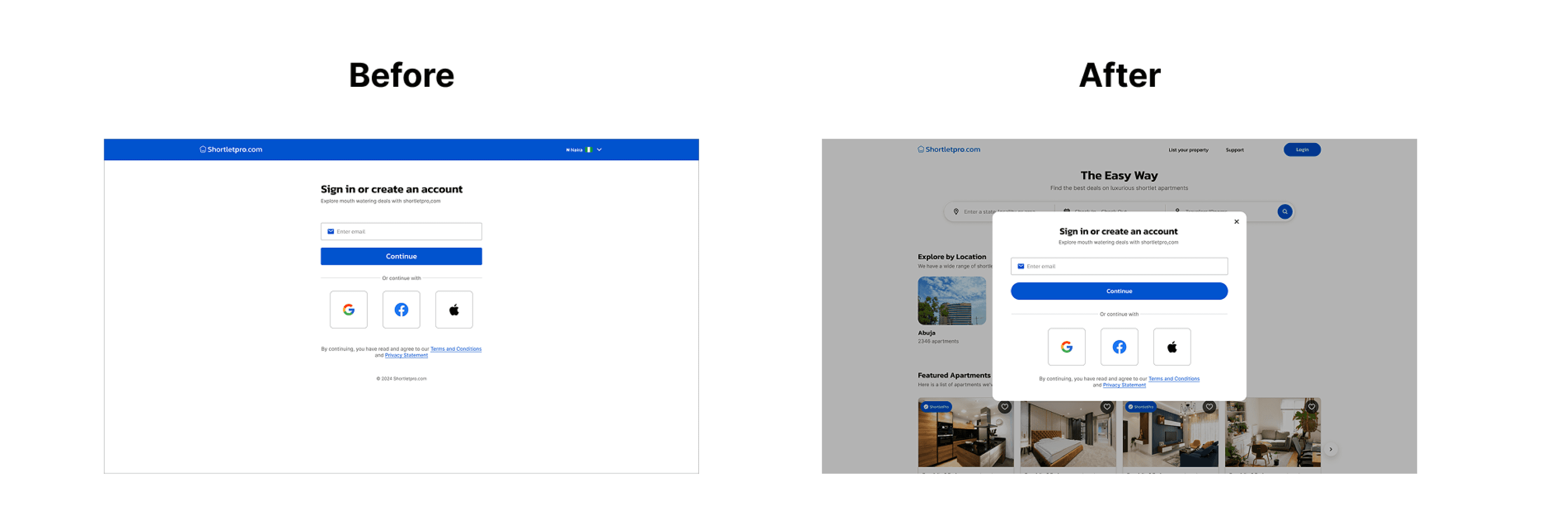
Onboarding
The client requested that we change the onboarding screens from a full screen, to a pop up modal drawing inspiration from Airbnb. To ensure the modal was always visible, we added an overly to the background.
Home screen
I replaced the hero image with a plain background to make the form more prominent.
Conclusion
Managing complex booking processes, from searching properties to payments and cancellations, taught the importance of designing clear, simple flows that minimize confusion and error.